From the outset, as a group we wanted to base our short thriller opening on something psychological, this because when watching thriller films they are the ones that keep the audience glued to screen wondering what is going to happen next, truly what a thriller is all about.
Individually we researched many thriller films, to get into the right mind set as to how a thriller film is set up and what they employ to make the intro all the more captivating. I chose to look at The Silence of the Lambs and Taxi Driver as films I have already seen i thought it would seem logical to look further in to them. Both contain a male lead character, whose lives revolve around lonliness and seperation, leaving their own minds to be negatively altered by their isolation. Too me this really jumps out as something I would like to see, so to use it would make sense.

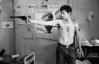
The idea of isolation is furthmore shown in these screenshots, 'Dr. Hannibal Lecter' (right) is seen behind bars furthermore showing how he is locked out of society and on the left, 'Travis Bickle' a taxi driver sent insane by his own company.
The idea of isolation was certainly what we wanted in our group, some of the all time greatest thrillers were centered around this idea, and it really opens up endless possibilities - which is why we went with our final choice of insomnia.
With the idea of insomnia already in place, we had to find a setting. It was clear to us from the start that we would need two settings, one a fair simple bedroom scene and the other outdoors, somewhere vulnerable, cold and dark - from this we listed some possible locations and settled on a forest or woods as it would be an alien landscape for the character. We wanted the audience to wonder what was happening, a dream or reality and the huge contrast between the two settings really helps us create this effect.
We have tried to add something else to the film, that is different and shows we didnt copy any other films and the is the light ray effect used on all of the shots when the female character is in her dream like state.
9 Shot Sequence.
Here are 9 screen shots taken from our thriller opening.

2. This close up shows us her full face and shows us how she is emotions much closer. She looks lost, suggesting the later woods scenes. Face is split, light and shadow, as if she has an alter personality.
3. We can see her in the mirror, which gives a great sence of her being spied on. The tablet has a dominant position on the table, almost showing dependance on it, once again showing vulnerability.
4. This shot is her waking up on the forest floor, she looks confused, and as if she doesnt know what is going on. Once again shows close up emotions. The light filter helps to emphasise the dream like state.
5. Shot 5 shows that the character is lost, both literally and in her own mind, her aimless wandering is show from this high angle where we see her just walking again. White dress is shown in full, shows her purity and innocence. The innocence furthmore backed up by non-diegetic track in the background, a nursery rhyme, which is usually associated with happiness and joy.
6. (accidently put 7 twice... so the first one!) This shot shows once again her purity, in her current state she is easily distracted and the string in the tree draws her attention, showing she is carefree and calm in the dream.
7. We are then shown her tossing and turning in her bed, she looks very uneasy and stressed, symbolising that something will go wrong in her dream.
8. This shot shows her trapped, confined to a small area, representing that she cannot get out of this dream. Shows that it could finally be too much for her, starting to get annoyed being trapped in the forest. So she could be hiding from everything.
9. In this shot, right before it cuts to black. She is paranoid hearing noises, then suddenly turns around to this shot and her face drops, she is shocked and overwhelmed and we can immediately see that something wrong is about to happen, which is then followed up by two gunshots, throwing the audience in to wondering what has happened.
How does your media product represent particular social groups?
Our first decision was the character would be female, this as they are stereotypically shown as more vulnerable than men.
Then it was a case of age, we really wanted our audience to be captivated by the film and have some sympathy for the character. We decided that an adolescent girl would be best, aged 14 - 18, often a time in life where peoples minds can change very drastically and have huge effect on the lives of the person.
Her outfit was chosen with one thing in mind, the purity that it represents, it makes the girl look very pure and innocent, the type of character than is often vulnerable in films. The style is very old fashioned and not something a teenager would wear these days. This could represent how she is different from other young females.
The makeup throughout the shots is very important, from the start of the shots we can see she looks very tired, and represents that she could have somekind of sleeping disorder. Her face looks very exhausted and represents that she is tired of how she is currently feeling.
She is quite the contrast to the usual teenage girl, she appears very submissive and shy and dresses in an older style, adding to the vulnerability.
Her facial expression throughout is often as if she is lost and confused, this helps the viewer to feel empathy for her in her dream state, as it becomes clear something is about to happen to her.
What kind of institution might distribute your media product and why?
Distribution.
It is the distributors job to get the film from the final product to in the eye of public, they need to make it look like the best film of its kind and to get it as much in people faces as possible.
As films are only be released once it is important that when they are finally revealed that there is as many people as possible wanting to watch it.
The producers put a certain amount of money in to getting the film advertised, then when the profits from cinema viewings, dvd sales and other incomes come in they are split, so it is important that the producers do as much as possible to make a lot of money, a good example of a symbiotic relationship between the two parties, as it benefits both financially.


These three pictures are of some of the most well known distribution companies in the world, many top films have come through them, hence the huge reputation they have, becoming household names through the films they have represented.
There are many ways in which films can be advertised, almost all big budget films capitolise on these and use any means possible to advertise the movie, some examples are as follows:
Magazines, they offer interviews with the stars involved in the films as well as reviews written by very good writers. These magazines are very popular amoungst women, so this creates a lot of fuss if a film is represented in one of these magazines.

Billboards and outdoor adverts. Seen a lot in urban areas, anywhere there is a blank space not filled, an advert can often be seen. Distributors pay for the right to have there product shown out in public, often seen on busses, sides of building etc.

Movie premieres. 'The red carpet' a term often used to describe them. The big names in movies come to 'strut their stuff' on the famous red carpet infront of, as you can see, photographers, often hundreds, this is a huge advert for the film and a huge publicity stunt for the film.


Talk shows. The big name stars often appear on prime time TV to talk about there recent role, the viewers get a sneak preview of the films best bits and want to watch the rest of the film.

Other methods include TV adverts, shown on most TV stations they show some action from the film to induce the audience. In past times newspapers were often the main source of cinema listing, before the people had the internet, more recently film adverts are seen online to the side of webpages.
It is fair to say that advertising is everywhere, to go through a normal day without seeing an advert of some kind would be impossible, this is why it is very important for the distributor to advertise well.
In recent times, films are not only seen at the cinema, they are also availible online, through games consoles and smart phones and in other ways such as DVD and eventually TV.
As for our product, i think i would like to see it distributed and seen only on the internet, as we embark through modern times it really is where everything can be seen, it would make us very unique and it could prove risky but I would prefer something different for our product than entirely similar to every other film at current times, making ours much more unique.
Who would be the audience for your media product?
The target audience for our film would ver much be for people aged 15 - 25, one reason is that this is the age of the main character, so would appeal to them most.
It is aimed at both males and females, as it female character whose personality is not revealed a lot, neither males nor females can relate overly to her, but people would like to see how the rest of the story pans out, and can relate to the character via empathy.

Other similar films are:
Inception is somewhat similar to our movie as it uses alter realities to confuse the watcher and question reality, something that we wanted in our thriller.

The Blair Witch Project is similar to our
film as its setting is in a forest, using some
of natures creepiest and most unknown
 |
| This is the 15 certificate logo. Would be displayed on any box containing the disk and all advertising means used. |
areas to keep the viewer on the edge of their seat
As a thriller, it would be given a rating by the British Board of Film Certification or BBFC, they are responsible for setting the age restriction for all British films. There are a number of criteria that alter the certificate, such as swearing, sex and nuditiy, violence, drugs and fear.
As our film is only an introduction, I feel that, if continued to completion it would involve most of these criteria, which i think would make our film a 15 certificate. 18 would be too high, as it is older than
our the lower end of our target audience.
How did you attract/address your audience?
We used a number of means to attract our audience.
The young character would appeal to our target audience, someone that people could relate too, and possibly to the emotions expressed throughout the film.
The setting is very uni sex orientated, the bedroom for example is very plain, this so that it does not represent one gender more than the other. Thus keeping both genders as primary in the target audience.
I asked a few of my friends and colleagues what they thought of the film, as they fit in to our target audience they are the right people to be asking what they think of it.
'I enjoyed the opening, very eerie! Loved some of the shots used especially the mirror shot.'
'I like the effect used on the shots in the woods, creates a fantastic dream like effect, some good and original shots.'
'The music goes well with the sequence, but is a little too loud i think, title sequence looks very fresh too!'
'I like the mirror shot, but not too keen on the title sequence or the shots of her wriggling in bed'
I was fairly happy with the comments, they seem quite fair. And they mostly agree somewhat in the way i feel our film has ended up. You can tell that we ran out of time on the whole thing and it is shown by some time saving cuts we made, which with some more time we could definately polish off some of the mistakes.
What have you learnt about technologies from the process of contstructing this product?
Planning:
We firstly got introduced to the equipment we would be using for the preliminary task, a small scale film to get used to the camera equipment and see what roles would best fit us. We quickly established that Amy Z would have to be in the film are managing to break two light stands in 10 minutes!
Next up was using the equipment, it was established that i was the going to be incharge of the camera, so learning how to use white balance, how to frame shots etc was very important. We spent quite a while practicing tilts and panning shots so that we wouldnt have to film to many takes when doing more complex shots.
We then had to test with lighting, as none of us have any major filming history this was all new to us, we had to discover lighting techniques and use them well to create the right scene, in the final product, our first set of shots inside filming in the bedroom were very bad quality, and the camera - which was different to the one we origanally wanted - was not set up properly..
Filming:
When we initially started filming, i dont think we realised just how long it took, we then started to rush shots, partly due to the freezing weather, and the quality was duely affected.
It was during filming that we were tested most, the lighting had eluded us already, so it was important to get right second time round. We tried a different camera, as the one before was not of the best quality, but as we set out for filming, discovered that we had not got the tape to film with, so had to do the ring around to find someone local with a camera, luckily a friend of Jacks had one, and we completed the filming, bettering all of the mistakes made in round one of filming.
Another mistake we made with the lighting was the filters, we set the white balance when it was in, when it should have been the other way around. A mistake that we made up for on the second time of filming.
Editing:
The editing side of the project was particularly challenging, it was a very long winded process for us that took a long time to get used too. Final cut pro was very hard to use, especially the long winded rendering process, with not having any experience on editing software, i couldnt get any of the ideas i wanted on the screen with out having to explain what i meant rigorously.
The editing side of the project was particularly challenging, it was a very long winded process for us that took a long time to get used too. Final cut pro was very hard to use, especially the long winded rendering process, with not having any experience on editing software, i couldnt get any of the ideas i wanted on the screen with out having to explain what i meant rigorously.
The macs were also something that i could not get used, having used windows computers all my life, the little differences and things im used to did not work well together and it was hard to use them. However we got it done in the end, and looks almost how we wanted it.
The title sequence was another thing we didnt have enough time to complete, and ended up doing a few simple effects, i was quite persistant in how i wanted it to look and I am happy that I made them continue to add more effects too it and I feel it is quite good.
Looking back at your preliminary task, what do you feel you have learned in the progression from it to the full product?
Looking back at our preliminary task, you can see some big improvements in what we have done, our overall knowledge of how to use cameras to a visual benefit have come a long way with the practice we have done, barriers overcome and the lessons we have received.
I will present some screenshots of both of our products and see how far we have come along.

Firstly, here our the two title sequences, the first on the left, we had no experience on what to do, so opted for the simple option, not a lot of originality and a very simple font that has no meaning at all. The frame is not as nice as the new one, the title is one of my favourite parts of the film, the expanding text mixed with the slowly rotating background gives a great effect, very eerie, and with a bit more tweaking, i believe could look very proffesioanl.

These two shots differ greatly, yet you can still see the progression made, the prelim shot on the left has quite bad composition, not centered enough and too far out. You can also see things in the background that we did not want there, something we really worked on in the final piece, so that everything in shot, we wanted. The composition in the right frame is a lot better, and again we see a lot more originality. The lighting is a lot better than before, even though we did use it, just not efficiently enough.

Here you can see the huge contrast in shots, although the prelim has good framing, we have used no post production effects, so looks quite boring and not proffesional at all. Again notice the junk in the background, which we did not want or intend to be there. The shot on the right looks a lot better, and really conveys the dream like state it looks like a dream, and that is what we intended.

These two shots are to show the continuity editing that we used, both are part of a sequence of shots, the prelim task we did not try anything extravagent and provided not close up shots, just long and boring sequences, somewhere that we have definately improved on.
Other things:
Sound. We have improved somewhat over the year, as the prelim had no non diegetic sound added whilst editing, whereas the final piece had numerous non diegetic sounds incorperated.
Ideas. We had a lot more original and creative ideas in the final piece, whereas the prelim was a standard nothing flashy sequence. Something that we wanted to improve a lot when discussing how to progress our ability.
What we could improve.
If we could re edit our sequence, I think there would be a few things i would change, firstly, I would change all of the sound in the film. The non diegetic music is good, but i think the opening music isnt perfect, and the soundtrack when she is in the dream could be tweaked. However, we have not incorperated enough foley sounds, and the ones used arnt up to scratch.
I would then improve the title sequence, I like it, but it is very short, and has a lot of potential to be made better. We should have included some more titles and names and made the whole sequence longer and bolder.
We could enhance the visual effects, they are the effect we initially wanted, but perhaps seem to strong, it is very apparent she is dreaming. So maybe adding a few shots that dont have the effect would confuse the viewer. They also need to tweaked as in some it gives great effect, e.g. the spinning trees shot and the string in the tree pan shot. Then in others it just comes on too strong and overpowering.
All in all I feel it was a big learning curve, and next time, the final product will run a lot smoother, we made some big mistakes which can be avoided next time, and then hopefully we will develop in our movie making skills and could make a better movie opening.
No comments:
Post a Comment